Not actually practical

We have an addition in the office:

Skatoll
Skatoll

This desk has been in my parents’ house for ages. It used to be in the dining room while we lived in Hamar, and lately my father has been using it for his laptop when working at home. I remember that we got it from someone in  the family way back when, but I can’t remember who, or why, or exactly when that was. I need to get some details from my father, I guess.

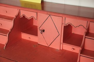
However, it is old enough. The colour is rendered pretty accurately in these pictures. It’s not really practical, which is why my father didn’t want it anymore. I don’t really have any plans for using it yet. In fact, I was all set to store it in the basement for the time being, when the husband suggested we might as well have it upstairs.
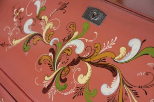
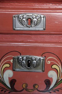
Detail of front
Detail of front
One drawer has a fake lock, the rest are real.
Inside drawers
Inside drawers

So. It’s not practical. The ground colour is – well – hideous. And I can’t really paint it, since I want to keep the rosemaling, even if it’s (probably) not the most impressive example. Still, it’s got history and it holds memories for me personally. It stays.
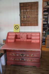
Desk open
Desk open

Note the yellow poster, by the way. My mom left a few bits and bobs in one of the drawers, mainly scrap paper and such, thinking the lass and I might find use for it in crafting projects. Among them was this poster. It says: “Not ready for cleaning.” I threatened to get it laminated and hang it on the front door any time my mother or my mother-in-law comes to visit…

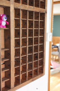
To fit the writing desk, we had to move a tall chest of drawers (which were not meant to stay in this room anyway), and there was suddenly space to hang my type case. I found another one recently, which turned out to be perfect for displaying regular size minifigs, but not so good for the Toy Story characters I recently aquired.
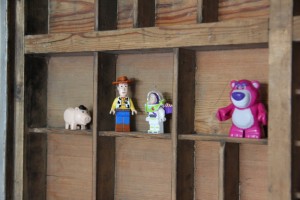
They fit nicely in here, though.
See where the type is still marked on the case?

Which gave me the idea that perhaps this desk would be the perfect Lego-building site. We’ll see.

Lovely

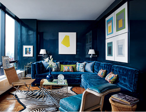
I’ve pinned this as well, but just have to repeat it here. I love, love, love this interior:

Living room by Todd Alexander
Living room by Todd Alexander Romano

I’d change the artwork (not a big fan of non-figurative art, on the whole) and though I think the zebra skin rug looks stunning I wouldn’t actually want a real one on the floor, but a BIG yes to those laquered walls and the frankly gorgeous sofa.

More detail in the article in Architectural Digest.

(via)

Reading

It should come as no surprise that I like reading. And books. And any art that involves either is immediately interesting to me.

For the hobby-/guestroom we had planned to get a Hemnes daybed from IKEA, furbish it with proper mattresses and quite a few pillows and a good reading light, so as to cater for guests (hence the essential “good mattress”) and reading (pillows and lamp, though the essentialness is a bit overlapping, obviously). The nice people of IKEA decided to have a 30 % sale on Hemnes this week, so we now have one Hemnes flatpacked on the floor, waiting for this weekend when we plan to move the lass into her new room, thus freeing up the space in the would-be guestroom.

Over the daybed, I’m planning to frame reading related “things”. I have som old (well, late 90’ies) ads from Waterstone’s (that I just LOVE), and I have one or two prints purchased off Etsy. I would like some more of the latter, though, so today I’ve been browsing, and tomorrow, once I’ve had time to consider which ones I really like the most, I’ll be putting in a few orders.

Here are some of the ones that immediately appealed to me:

read1


“The reader” by Majalin

read2

“Girl reading” by Belafonte (Emma Leonard)

read3

“The boy who liked to read” by TheExtentofSilence

read4

“One Story More” by trafalgarsquare

read5

“Books can take you anywhere” by TheLittleFox

read6“Reading is rad”/”Girl in green socks” by Artisjustfrozenmusic ( Carla Thursday)

Since it’s expected that the lass will use the space as well as us “grown ups”, I quite like the idea of mixing the styles a bit, rather than sticking to a more coherent collection. Since they have a common theme, I think they’ll work together anyway.

Have you seen any reading-themed illustrations lately? Please let me know in the comments, I’d love to get some tips for more candidates.

Painting the “pink” wall

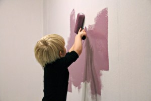
20110110_maleUhm. Well, things took a turn for the better at the shop. We had picked out a nice, bright pink, and I’d gone to stand in line to get it mixed while the lass and the husband wandered a bit, and then the lass came running over. She’d found a new colour swatch. And she wanted that colour instead. Was she sure? Of course she was. And I wasn’t about to protest.

It turned out the shade she had found was not available in the paint type we wanted (Jotun Sense – we could have had it in Butinox Green Room, but I used the Butinox in our bedroom and on the doors and found the coverage to be appalling. I ended up with five coats on some of the doors!), however it was a little dark anyway, so a slightly lighter version of the same shade was settled on before the lass had time to change her mind.

The original colour was “5786 Lavendel”. And here I was going to link to the Butinox Green Room colours, but no such luck, there doesn’t seem to be a web page for it. Is it just me or is that a little strange? Aaaaanyway, its not really lavender, more aubergine (eggplant), though not quite as dark as that. And the code for the one we ended up with is 4030-R50B. It’s less pink in person than it looks in the picture, and also darker (it dries darker, that is).

The lass insists on calling it pink, however. She also exclaims how beautiful her wall is. I have to agree, it’s a nice colour. I’m quite happy to be able to call it purple, though.

Shuffling the cards

You know the room where I just tore down the horrid, horrid carpet wall covering? Where we meant to have the hobby/guest room? Well, progress is being made. There is now paper up on the wall where the carpet used to be, the moulding is all white (one more coat needed) and paint is going to come up on the walls quite soon. And on one wall? Probably pink paint.

See, we’ve come to the realisation that we have to move the lass from her current room. We did absolutely nothing in there, luckily, so no work gone to waste. The problem with her in there is it’s next to the bathroom and when someone takes a shower it sounds like a really bad storm or something. Which means we can’t really have a shower when she’s sleeping, whether it’s in the evening or the morning. This is, you could say, a tad inconvenient.

So. Since we’re so good a procrastinating* this realisation came to us at the perfect time, just in time to change the plans for paint in the room we’re working on and move her in there, then we can do a little bit of work on the room she’s in now and get the hobby room set up there. The shower thing will be a problem whenever we have guests, but that’s not going to happen often enough to warrant worrying about it. Once we get around to doing up the bathroom – a few years down the line, probably – we can consider a little measure of noise insulation.

And, yes, pink. I told her we would paint three walls white and that she could choose a colour for the fourth. So far she’s insisting on either green or “girl colour” (jentefarge) with a heavy leaning toward the latter. So I’ve told her she can have pink, as long as she starts calling it pink, not “girl colour”, since there is no such thing. It seems to be sinking in. Well, the calling it pink part, anyway, I guess I can’t expect to conquer the combined force of society’s genderization of colour in just a few sentences, but I’ll settle for the naming part for now.

I’d try to convince her to go for green, except I’m planning on buying closets and such from IKEA in the new Stuva series with green fronts (mainly because the pink and blue are of such insipid hues) and figure it will be easier to match with a pink than finding the perfect shade of green paint. Also, I figure it’s better to let her have SOME pink, then hopefully she’ll grow out of it at some point. If we were to be militantly against it might become an obsession, which would not be a good thing.

______________

* And boy am I glad we have been procrastinating on this, it would have been a major pain in the ass to discover this after having set the hobby room up with desks, computers, sewing machines and craft supplies. Major, major pain. Procrastination FTW

Somebody else’s kitchen

There is very little happening on the interior front at the moment, partly because we’re slow, partly because Christmas is not the right time to have the place all ahoo (though my mother and mother-in-law would obviously claim it’s all ahoo right now, but who listens to them, anyway?) and partly because all three of us have been knocked out by some sort of thing going round. The husband seems to have a straightforward cold, but the lass and I have something more complicated and fluey. She seems to be better, though, and is back in daycare today, while I finally get to sit down and simply be sick instead of also being mother, at least for a few hours. Bliss.

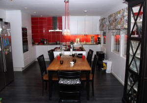
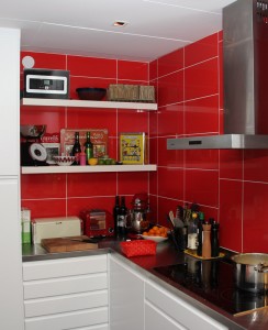
Anyway, we visited with friends in Sweden a little over a week ago, and I grabbed the chance to shoot a few pictures of their excellent refurbishment job, mainly for my own reference, since they’ve managed to get quite a few details in that I really want to make sure we remember whenever we get around to doing something with the kitchen here. But since I’ve got the shots I thought I’d share. They were shot at night, which was a bit stupid of me, but I didn’t get around to it earlier, and there was no attempt at styling (which will be obvious). Still, here goes:

Overview
Overview

I love the red tiles with the white fronts and black floor. I also love the lamp over the dining table, which is unusual, since I hate most lamps I see. The table is a natural gathering area, I’m a sofa-person myself, but even I tend to sit at the table here – it’s in the centre of the open-plan living space (the sofa area being off to the left of where I’m standing to take this picture), and it works really well.

My absolute favourite part

Ignore the dirty dishes, look at that countertop, and most especially look at that sink! It’s huge! Certainly big enough to get full-size baking sheets and oven dishes in without any sort of maneuvering. The countertop, with sink, was made to specifications, so it fits the whole counter seamlessly. This is top of my list of WANTS for our own kitchen.

The corner
The corner

Some open shelving in the corner provides an opportunity to display a few decorative (and useful) items.

Details, details
Details, details

But this, this is perfect. It’s located at the dining table end of the kitchen island and can be hidden when not in use. It provides power for laptops used at the dining table or in the kitchen for recepies, and for charging mobiles and other devices right there where people congregate. Such a brilliant detail.

In fact, apart from changing the black laminate for linoleum flooring, I’d quite like to simply adopt the whole kitchen as it is. Problem is, it won’t fit in our flat. Pity. Still, inspiration is good, too.

More hooks

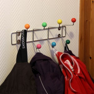
We followed up the Oslo Whiskyfestival with a short cruise to Fredrikshavn, and with 12 hours ashore, we decided to take the bus down to Ålborg instead of hanging around Fredrikshavn. In Ålborg I had noted down a couple of shops I wanted to visit, and one of them was Tiger. They had a lot of almost interesting things, but very few interesting enough to tempt me, but I did find some more wall hooks, or coat hangers or whatever you’d call them. Blatant rip-offs, obviously, and normally I don’t hold with buying designer rip-offs, but what with the problems I’ve been having finding any hooks I like and that actually work, in that it’s possible to hang something on them and expect that it stays there, I thought I’d go for them. Also, they were only 30 DKR each. Later the same day I saw some others, also quite blatantly rip-offs, more or less identical, at 6 times that. I mean, if you’re buying rip-offs, why pay more than you have to?

Anyway, they are up now. One has replaced the very cute but completely useless (in that it would only hold two garments, and not very bulky ones) coat hanger from IKEA that we put up in the hall for the lass’ clothes:

See: More than two garments, and bulky ones at that. And still there's room for more!

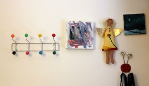
The other one has been added to the bedroom wall, where some odds and ends have also come up:

20101114_knagg2The crooked (my fault, I haste to add) picture is a present from Tonbel, the angel from another good friend and the messy artwork is the lass’ “creation”, with rather a lot of help from the daycare staff.

Score!

Saturday afternoon we visited IKEA. Since there were a few specific things on our list, we started in Rotekroken – the section with all the stuff that’s been displayed or returned and is being sold at reduced prices.

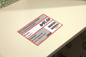
And what do you think we found? A limited edition Billy bookcase, that’s what.

20101104_billy1

Billy is 30 years old, and to celebrate, a special edition was designed by IKEA designer Annika Bryngelson. They were supposed to be available from 1 October, but we haven’t been able to find them. And though we are sticking with boring old oak in the living room, we thought one of these would be perfect in the craft room to hold comics.

20101104_billy2Though it would work for Shakespeare, too, I guess. And we sure have a few volumes to host with his name on them, too.

20101104_billy3I love it. It came with shelves, by the way, but we had to remove them to get it home, and haven’t put them back yet. All in all we were pretty happy just to find the darn thing, but the best thing? The price:

20101104_billy4I don’t know what’s up with that. I’m pretty sure the “was” should be the same as standard Billy, which starts at 365 kr for the plain white. You won’t see me complain, though.

Oh, and three steps down we found another Billy, this one in oak, which was one of the things on our to-buy-today-list. Nice.

A blank canvas

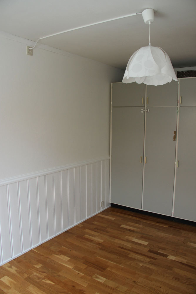
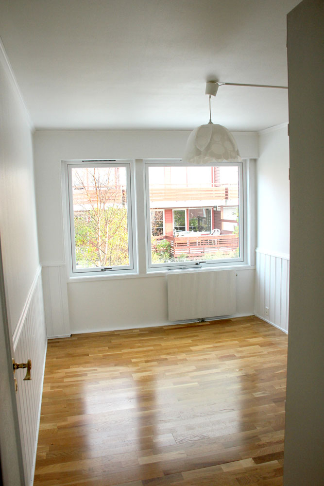
The painting in the “master bedroom” is now done.

Though the closet doors could use a lick of paint, I guess...
Have I mentioned that I love the flooring? No? Well, I do.

Now to inject some colour. And play around with the layout. Mind you, once the bed is in place, there will be limited scope for playing around.

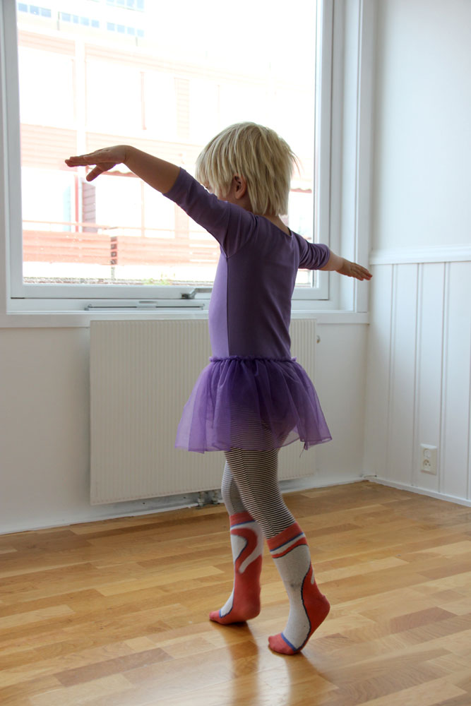
Which might be why the lass thought it best to use the room for ballet practice while it was still empty:

She calls it "billet", though. May I also point out that she chose the socks herself.

So near, and yet sofa

‘Scuse the pun.

The inlaws came by last week to “see how far we’d gotten”. Well, I suppose the conclusion was “not far”. We’re ok with that, though, we plan on living in this flat “forever” and so we feel we have time to work out how to get it right, to find out what works and what doesn’t.

My mother-in-law would probably lose her mind in a very short time if she had to live in our flat the way it looks now, though. So would my mum, come to think of it. We’re ok with that, too. They don’t have to live there. We do, and we’re comfortable in stepping around and over boxes for days, weeks and months before figuring out where the contents go – or having the energy to put them there.

There are other things we don’t see eye to eye on, too. My mother-in-law thinks the brick walls (which we’ve discovered are actually tiles made to look like bricks) look nice. We said she could have them. My father-in-law expressed, the last time they visited, the opinion that we should try to keep the amount of bookcases in the living room to a minimum. Yeah, that’s going to happen.

At the start of the visit it became abundantly clear that the current seating arrangements in the living room, though fine when it’s just the three of us, is not really adequate for visitors. Well, I say “arrangements”, it’s more a “where the sofa and chair happened to be put down” situation. I commented on the fact that there was really no place for them to sit and that we’d have to think about a solution. My mother-in-law suggested that what we needed was a corner sofa. Or another sofa, I suggested, so we can make a corner. Well, yes, but she really thought a nice corner sofa would be best. Yes, but then what would I do with my beloved sofa, I wondered, as I want to keep it. Well, we could just shove it into one of the bedrooms, in her opinion. I explained that this was not happening, since we have plans for the bedrooms which do not involve a spare three seater.

I’m pretty sure she wasn’t convinced, but then she doesn’t have to be, I suppose.

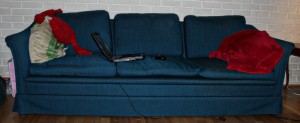
This is my sofa. I love my sofa.

Cleverly styled with the husband's laptop open

I purchased it at a flea market in Oslo for 200 kr, and paid another 300 to have it delivered. It was worth it, I lived on the fourth floor, no lift. It is incredibly comfy, the material is obviously hard-wearing, it’s just long enough to sleep on, I think the shape is cool and I adore the colour. It’s also pretty much the perfect length for the husband and I to sit at either end and play footsie in the middle.

Lately, it’s been the husband’s seat more than mine, I’ve sat in the various chairs we’ve had after we moved to more than 32 square meters. But I still love it.

So now I’m surfing for new sofas, starting with finn.no. I guess we’ll be holding our eyes open at flea markets, too. And we’ll get one the husband likes, then he can have that and I can have mine “back”.

The main problem is getting one that fits the requirements: Comfy, at the right price and not butt-ugly. At best it would go with the other one, but that might be a bit too much to hope for. But I draw the line at butt-ugly. And since I think 90% of all sofas are butt-ugly and a fair few of the ones that aren’t are quite impossible to sit comfortably on, we might be searching for a while.