There is very little happening on the interior front at the moment, partly because we’re slow, partly because Christmas is not the right time to have the place all ahoo (though my mother and mother-in-law would obviously claim it’s all ahoo right now, but who listens to them, anyway?) and partly because all three of us have been knocked out by some sort of thing going round. The husband seems to have a straightforward cold, but the lass and I have something more complicated and fluey. She seems to be better, though, and is back in daycare today, while I finally get to sit down and simply be sick instead of also being mother, at least for a few hours. Bliss.
Anyway, we visited with friends in Sweden a little over a week ago, and I grabbed the chance to shoot a few pictures of their excellent refurbishment job, mainly for my own reference, since they’ve managed to get quite a few details in that I really want to make sure we remember whenever we get around to doing something with the kitchen here. But since I’ve got the shots I thought I’d share. They were shot at night, which was a bit stupid of me, but I didn’t get around to it earlier, and there was no attempt at styling (which will be obvious). Still, here goes:

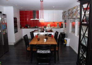
I love the red tiles with the white fronts and black floor. I also love the lamp over the dining table, which is unusual, since I hate most lamps I see. The table is a natural gathering area, I’m a sofa-person myself, but even I tend to sit at the table here – it’s in the centre of the open-plan living space (the sofa area being off to the left of where I’m standing to take this picture), and it works really well.

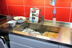
Ignore the dirty dishes, look at that countertop, and most especially look at that sink! It’s huge! Certainly big enough to get full-size baking sheets and oven dishes in without any sort of maneuvering. The countertop, with sink, was made to specifications, so it fits the whole counter seamlessly. This is top of my list of WANTS for our own kitchen.

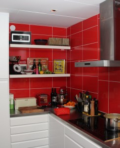
Some open shelving in the corner provides an opportunity to display a few decorative (and useful) items.

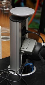
But this, this is perfect. It’s located at the dining table end of the kitchen island and can be hidden when not in use. It provides power for laptops used at the dining table or in the kitchen for recepies, and for charging mobiles and other devices right there where people congregate. Such a brilliant detail.
In fact, apart from changing the black laminate for linoleum flooring, I’d quite like to simply adopt the whole kitchen as it is. Problem is, it won’t fit in our flat. Pity. Still, inspiration is good, too.
wow, enig med deg:) Dette er et snasent kjøkken:) Vi skal ha nytt kjøkken til våren, ideer er velkomne:) Sånne som disse bildene:)
Klem fra Trine:)
Ja, ikke sant? Jeg suger til meg ideer både her og der, så det virket som en god idé å dele når jeg først hadde tatt bildene.
Herlig inspirasjon :)jeg er veldig glad i rødt jeg da , så de flisene var knalle :) Jeg ble så fasinert av den fiffige dingsen til slutt ! Vi har et kjøkken fra 64 , men det funker det også ;)
ha en super kveld :)
Klem fra Janne