December daily

ae_decemberdaily2011promoI’ve almost done December Daily for two years now. This year I think I may actually do it, since I’ve started putting a foundation together, which is much further than I’ve ever gotten before. I’m trying to mostly use stash I already have.

I’m a Journal Your Christmas alumni, so I’ll be getting prompts all though December, which is useful. I never actually DID the journalling, but I purchased the class in 2009, so now I get the prompts every year. Isn’t that nice? I’m thinking it will be possible to use ideas from that for the days when there’s little or nothing worth documenting happening (and since we both work full-time I know there will be days where all we have time for is the bare neccessities to get us through the day – I’ll document at least one day like that, but it might get repetitive if every weekday Monday to Friday goes: “Had breakfast, went to work, worked, went home, had dinner, put the lass to bed, zonked out on the couch, went to bed”). Shimelle’s prompts are great and though they are meant for scrapbookers you could also just use any old notebook and write, if that’s what you want. The focus is on telling the story, and not just of THIS Christmas, but of your childhood Christmasses and any other stories you want to tell. The class is highly recommended.

So far what I’ve assembled is an album, purchased with the intention of doing a Week in the Life, and never used for that purpose. I still want to do Week in the Life, but December is soon here, and the album is red. So there. It’s a We R Memory Keepers three ring album for 8,5×11 page protectors. I had a few page proectors to fit, but I’ve put in an order for some more, one of the purchases it’s hard to get around.
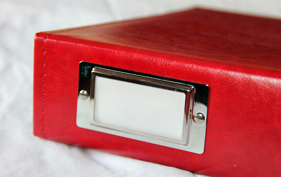
The album. It be red.
Oh, and the album

I’ve also purchased Ali’s overlays and templates. The latter are really great, and I can see myself playing around with them and using them for other projects, too (I tend to resize and otherwise modify templates all the time). Since my pages are going to be rather larger than Ali’s 6×8,5 I had to resize the overlays, but they came out fine. With a little trial and error I settled on resizing to 8×11, which alters the overlay’s proportions slightly, but not so much as to be noticeable. As our printer tends to default to A4 rather than Letter, this meant I could print with the minimum amount of adjustment. I also recoloured to a darkish red. I managed to make do with the cardstock I already had by mixing in some offwhite with the whites (pale gray, pale beige and pale purple).
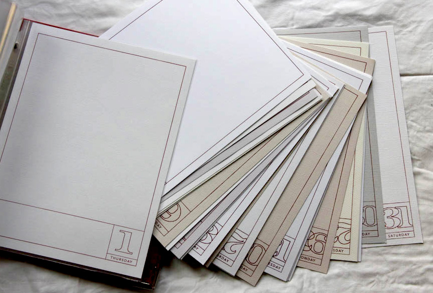
The printed pages
The printed pages

I’ve also gone through my stash and found some things that might serve as embellishments.
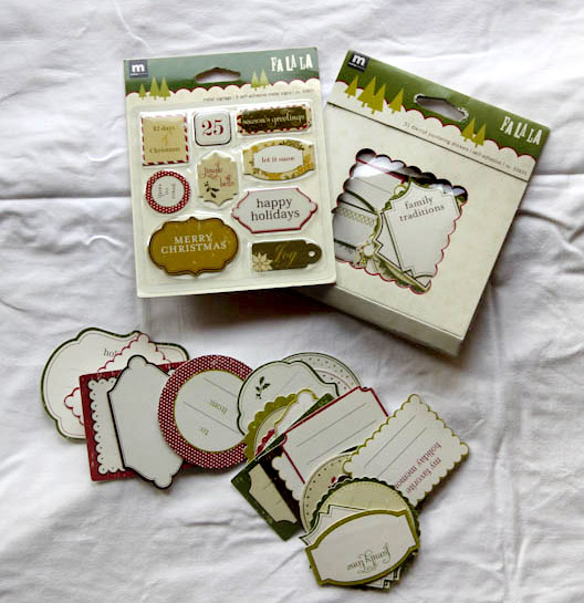
I had two packs of the journal tags, the contents of one pack in the front, the others are still in their packaging.
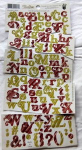
Letter stickers. Always handy.
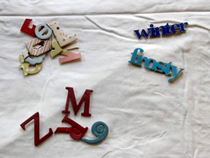
Chipboard
Chipboard

I’ve got a lot more chipboard letters, though not much of it is in the correct colours. The “winter” and “frosty” are from a lot I purchased off a member of scrapping.no a while back, so I have no idea where they’re from, but they are perfect. Well, except for the colour, but the nice thing about chipboard is it’s easy to paint.
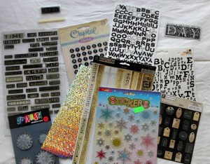
Stuff. Might use some of this, might not.

I also dug out some patterned papers and picked out the ones that were both Christmassy and that fit the colour scheme.
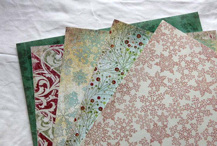
Five papers.
Five papers.

From left: Taylor “Ever Green” and Show-Offs “Deck the halls” from Daisy D’s, Fruitcake “Berry Branch” and “Snowed In” from Basic Gray and Holiday Collection “Alpine Snow Lace” from KI Memories. The Basic Gray ones have a near solid colour matching back, I might use those for some days. I’ve since cut strips to fit the bottom rectangle of the overlays from these, I’ll pick whichever goes with my pictures and other embellishments on the specific days.

I’ve got some stuff coming from Bananafish that will definitely be used, too. I purchased some supplies for Project Life from her just after the summer and fell head over heels in love with the wonderful little bits and pieces when they arrived, so I ordered more, including some Christmassy items, which will come in handy.

I really love what Ali is doing with the Hambly transparencies, but I think I’ll make do with making my own somehow (I’ve got some nice thick ones meant for laser copiers). I also like the baseball card size page protectors used to hold stars and other little embellishments, and since I have few of these I may be doing something similar. We’ll see.

For inspiration:

The Gambia photobook

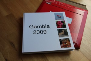
I seem to remember promising to post something about the Gambia photobook once I’d received the finished product. Which I did a couple of weeks ago. And I finally got around to taking pictures of it in daylight last week. So. Here goes, prepare for rather a lot of images:

I should have spent more time designing a cover.

I sort of forgot that I needed a cover. So I ended up just pulling out four random images that I’d not had occasion to use inside the book and plopping them into the spots suggested by the default layout. With hindsight I should have spent a bit more time investigating the options, I’d probably have preferred another base colour than white, for example, but it works, and I guess that’s the important thing.

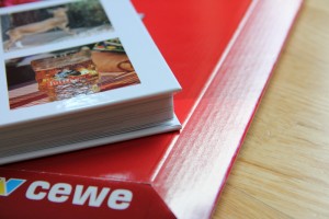
It's quite thick.
It's quite thick.

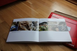
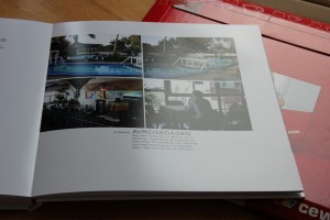
I ended up with close on 80 pages, and it’s printed on photo paper which makes it even thicker. However, it’s slimmer than I feared, I was a bit worried that it would be so thick as to be unmanageable, but it’s not. Far from it. It feels hefty and lovely, but is not so heavy that you need a reading table.

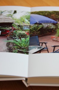
Continuous printing across two pages.

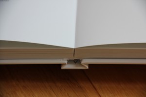
Another benefit of the photo paper version: The two facing pages are actually printed on one large sheet, and the sheets are glued back to back to create the book. This means that the book opens completely and no part of the page is lost “in the crease”.

Lies flat, without any support.

It also lies flat on the table (or floor in this case). No need to hold it open.

Minimalist design. Me?

I’m normally more of a maximalist than a minimalist, but just when it comes to photos I find I like as little noise as possible around them. I considered serveral design options for this album, and was planning, at the very least, to choose a colour scheme that I’d use for a few frames, titles and brush swirls. But once I started pulling together the pictures, I realised they worked so well on their own that embellishment would distract rather than add, so I discarded the idea.

The one digital scrapbboking supply I used was a set of templates called “Off to Press” by Paislee Press, available at Oscraps. The templates are for an 8×10 album, so I’ve gone through them and resized them to 12×12. I’ve also moved photo and text spots around a bit on quite a few of the pages, as well as resizing or even duplicating photo spots as needed. I really love this template set, as it helped me keep the look reasonably consistent and encouraging copious amounts of white space while being simple enough to be exceedingly flexible. 

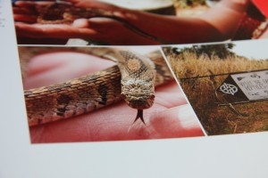
Ssssssnakes.
Ssssssnakes.

I’m really glad that I went for the photo paper option and didn’t fall for the temptation to save a few kroner by choosing a less expensive format. The clarity is really outstanding, any blur in the images is my fault entirely.

An example of a spread where the coninuous printing works at its best.

The other supply I used was a couple of actions from Pioneer Woman’s free action sets. Every image has had either “Boost” or “Define and sharpen” run on it, though on some I’ve reduced the opacity of the action layer(s) to avoid an overly processed look. In a few cases I’ve also used “Slight lighten”. Actions are a great way to get quick results for us lazy people, and I don’t think I’d have been able to finish the album on time without them.

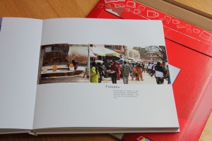
A page with a date.
A page with a date.

I normally date all my digital pages (with the date of the photos/subject, not date of creation), but since this is a cohesive album of one week’s trip, I only kept the date on the first page for each day.

All in all, I’m really thrilled with how this turned out. I had a serious attack of “Squee!” when I unwrapped this. The book, by the way, is printed at Japan Photo, who use a system called CEWE, which I suspect is available through other chains in Europe also, though I don’t know for certain.

Now all I have to do is get all my other photos into proper photo books. Yup. Well, one step at a time…

ABC

1-2-3.

Ok, so now I have a Jackson Five earworm. Sorry.

I just ordered this custom ABC for the lass printed from Shutterfly. A few sample pages:

A is for Ape:
A is for Ape

B is for Baby:
B is for Baby

C is for Chili:
C is for Chili

M is for Max:
M is for Max

I tried to keep the design clean and uncluttered. The background paper is by Creashens and the print alpha by Cathrine, both acquired from Catscrap.

Some words pose more of a challenge than others. Chili, for example, though certainly an ingredient in some of the food she eats is not a word the lass actually knows – yet. Also, since my setup was the “studio” picture with a white background I needed things that could be photographed like that, which is where the Duplo comes in.

The other words on the page include the names of friends and family and other words the lass is likely to know starting with that letter, and colours. The colours are also indicated by the type colour. I thought that was quite clever myself.

All in all I’m pretty pleased, and very excited about seeing it in book form.